
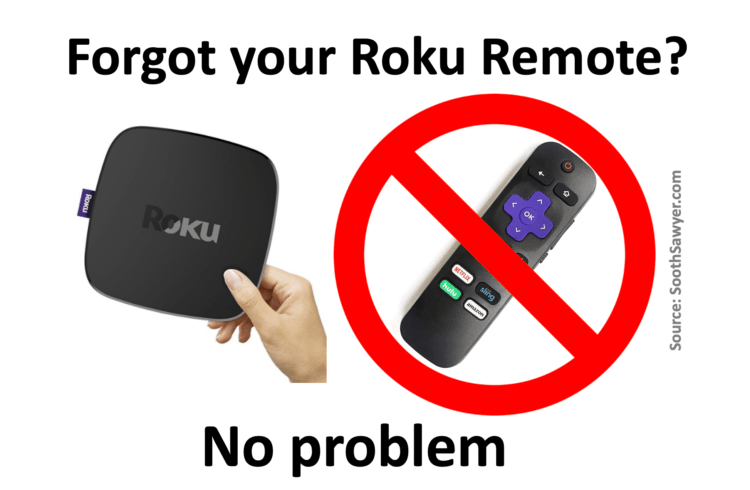
For vacations, Roku is a great device giving you access to all your streaming content from HBO, Netflix, Hulu, Disney+, YouTube, and more. But what happens when you forgot to bring your Roku remote? You can’t connect it to the new WiFi network and you can’t control it using your Roku app. Well, I have […]
Category: Random Topics
These are random topics that I thought I’d write about

Here is a short clip I created that loops to allow for a fun Zoom virtual background that looks like you are working on the 6th floor balcony of the Honua Kai in Kaanapali, Maui, Hawaii. There are two versions of this Zoom Background you can download: And don’t forget to throw on the requisite […]
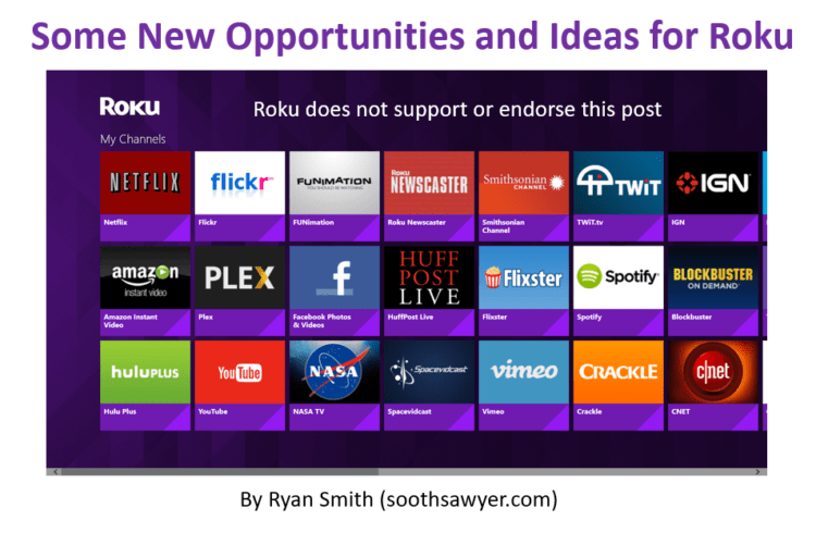
This is a one-hour brainstorming (more like a brain dump) session I had on areas that Roku can improve it’s offering and/or user experience, as well as cover some areas of opportunity. I think Roku has one of the best OTT offerings out there and I have them on all my TVs but there is […]
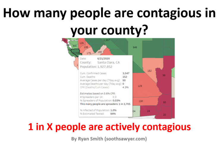
Have you wondered how to translate COVID-19 cases and stats into meaningful information like how many people around you are *actually* contagious? If so, you found the right place because this interactive map of the U.S. will show you how many people you have to be around to statistically bump into 1 person that is […]
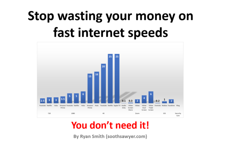
Do you pay for internet speeds >50Mbps? >100Mbps? You could be saving over $50/month just by reading this post. Save your money, you don’t need an internet plan higher than 50Mbps. Chances are, you just need to get a better Wireless Router or if you are lucky, you may just need to better locate your […]
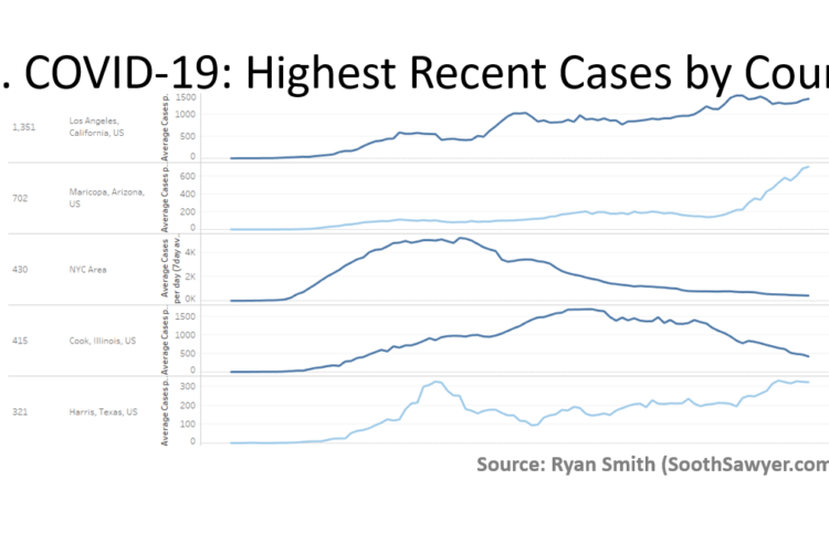
My Tableau visualization will allow you see the current hot spots (sorted by highest [7-day] average number of new cases in the last 15 days) in the United States. This has all 3,000+ U.S. counties and shows you the average daily new confirmed cases (moving 7 day average). Additionally, the color of the graph indicates […]
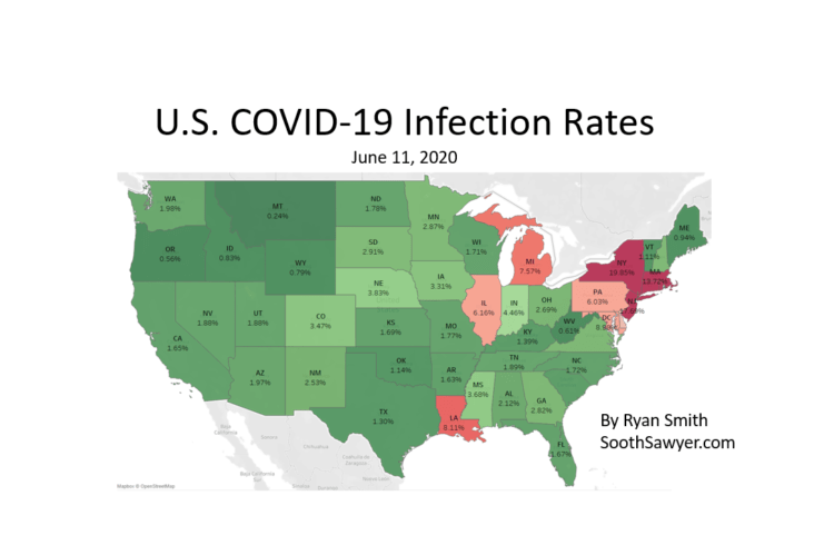
If you have been wondering what the infection rates for COVID-19 are in your state or county is, you found the one place on the internet that will cover just that. After analyzing numerous antibody studies, filtering out the non-scientifically approached ones, and correlating that with (1) other studies that looked at asymptomatic infections and […]
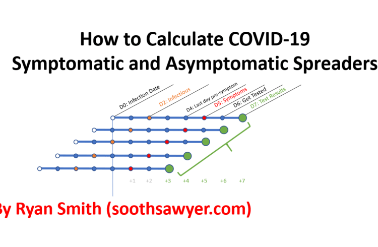
How do you actually use the data out there to determine your chances out there? I see the news cover confirmed cases and deaths but how does this actually translate into understanding what are your chances of bumping into someone with this invisible virus when you go grocery shopping? In order to help solve this […]

This post contains links to the Keystroke and Mouse Recorder demo that I created using PHP, Javascript, JSON, AJAX to show how easy it is to “screen record” your mouse movements and keyboard strokes (including password and credit card info) on the web. The Web Page Keystroke and Mouse Recording Demo I think it’s best […]

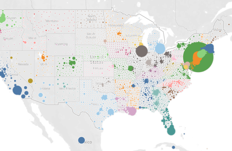
Click here to enlarge the picture Sometimes when you are playing with visualizations you run across something that captures your attention. This happened when I was looking at the over 3,000 counties in the United States, using population density. In effect, the image you are looking at above is the United States. I normally don’t […]
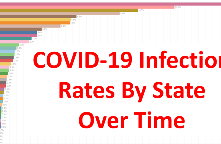
Hit play to see my estimate of infection rates over time for COVID-19 in the US: This is a race chart I put together using Tableau that illustrates my estimations on what each US State’s COVID-19 infection rate is on a given date. The estimation is based off of comparing many antibody tests versus actual […]
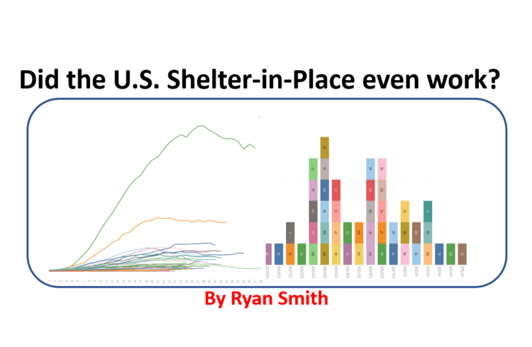
In this post, I look at all states in the U.S. by date, days since each state hit 500 cases, and days since each state’s respective shelter-in-place order. Each of these comparisons provide a unique way to accurately look for correlations. I then identify where each state’s peak is, and then compare how the U.S. […]
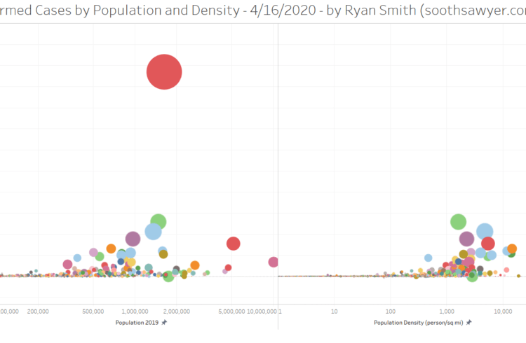
This visualization shows the growth in COVID-19 cases compared to population (4/16/2020, R=0.33) and population density (4/16/2020, R=0.75; if you look at this by Days Since instead of date, R>0.80) in the US (and the rest of North America), at the county level, from March 15th – April 16th. If you hold your mouse over […]
This visualization shows the growth in COVID-19 cases in the US (and the rest of North America), at the county level, from March 15th – April 15th. If you hold your mouse over a given county it will show you the cumulative cases/deaths, new cases/deaths, and ICU beds, in each county. You too can create […]
This is the ultimate GLOBAL data set for COVID-19. It provides population, deaths, land area, ISO codes, confirmed cases, deaths, ICU beds, workers, workers that take public transit, new and cumulative cases/deaths/recovered, day numbers (to compare on set of outbreak or quarantine dates), and more ..at the county level! Go to the bottom of the […]
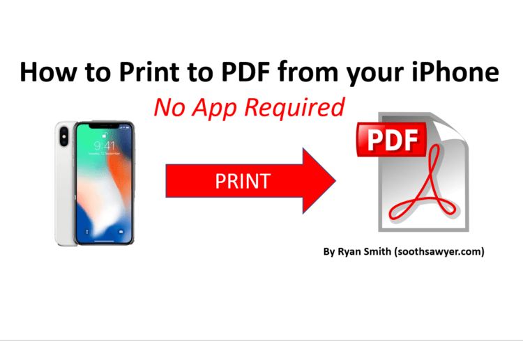
I just learned how to do this and couldn’t believe this was built into the iPhone this whole time. I love to be able to capture emails and/or web pages to PDF so that I can share them easily or save them for future reference. I always thought an app was required to have this […]
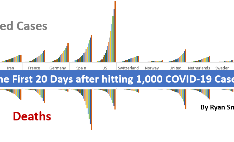
In this post, I thought I’d share with you a quick glance of what it looks like for every country that has had at least 20 days since hitting 1,000 cases, as of April 7, 2020. Let’s get started. First we will look at total confirmed cases. To orient yourself with my chart, the date […]
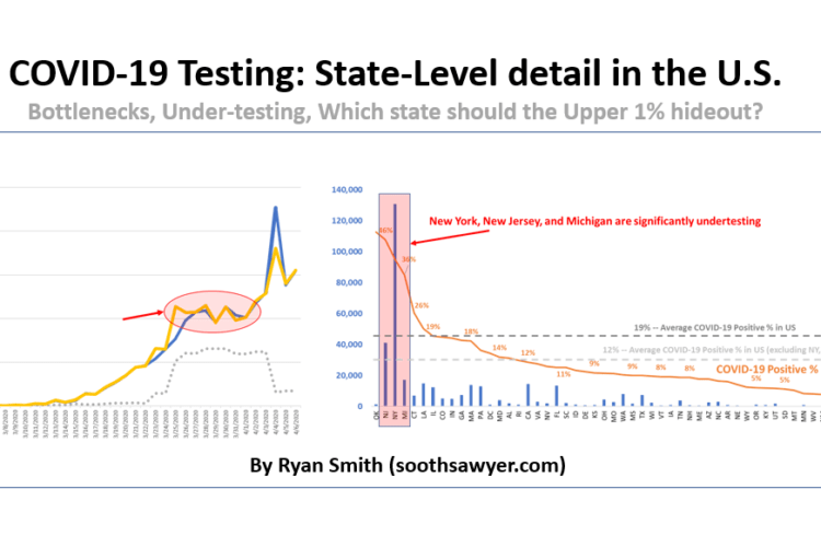
In this post, I will take a quick look at how testing is going in the United States by looking at how our testing has ramped, bottlenecked, where most of the test kits are going, where likely under-testing is happening, what the likelihood of testing positive is, and which state the upper 1% should hunker […]
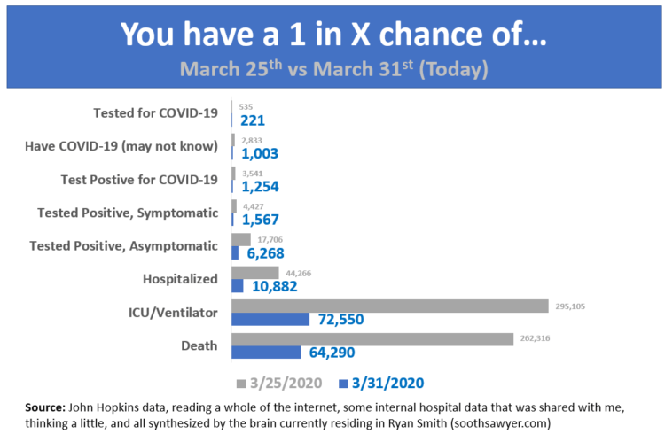
A quick graphic I put together to easily understand all the stats and what it means to you.. The data in this chart is all calculated based off of adults in the U.S. (257 million adults). -Ryan RyanI have been around IT since I was in high school (running a customized BBS, and hacking) and […]
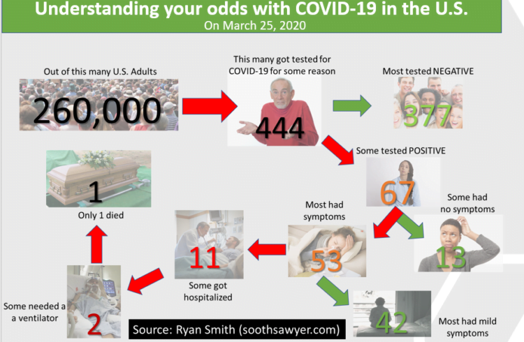
When it comes to COVID-19, it can be hard to understand how all these percentages and statistics you hear on the news are relevant to you. For this reason, I thought I’d create a simple illustration based on where things are at in the U.S. (based on my understanding of today’s figures, as outlined in […]
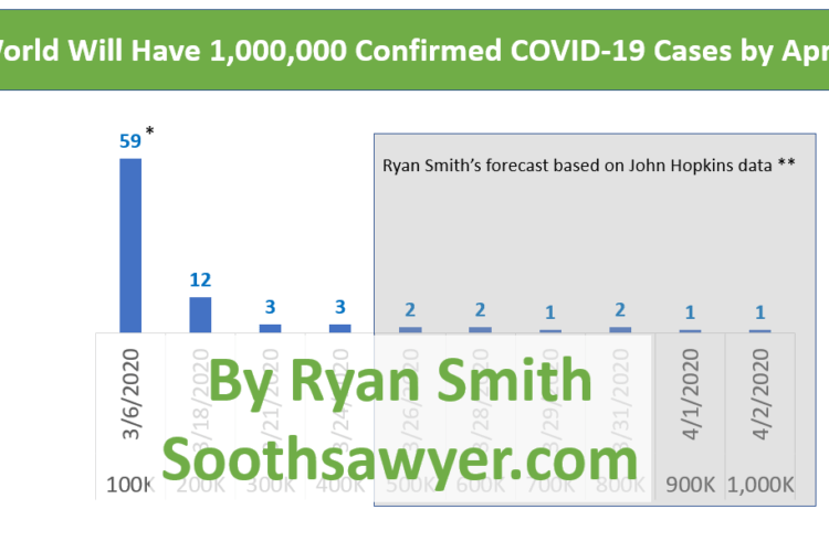
A day doesn’t go by without hearing someone talking about COVID-19. And with the 5-day moving average of the daily growth rate for confirmed cases hovering at 11% (16% excluding China), it’s hard not to see frightening numbers of new cases. On March 24, the global daily growth rate sat at 13%, excluding China (it’s […]
For those of you tracking COVID-19 (Coronavirus) thru John Hopkins, they modified their time series database schema on March 23, 2020 and deprecated their previous schema immediately. I recreated the older schema version of the following files (up to date with September 1, 2021 data). These files have ALL historical data from John Hopkins. You […]