
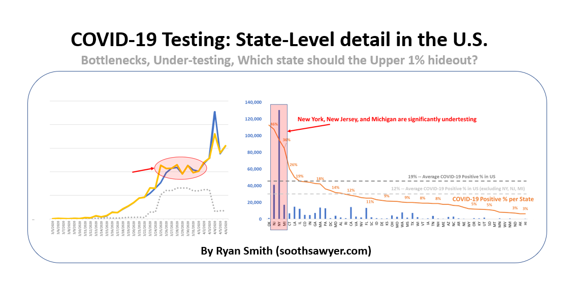
In this post, I will take a quick look at how testing is going in the United States by looking at how our testing has ramped, bottlenecked, where most of the test kits are going, where likely under-testing is happening, what the likelihood of testing positive is, and which state the upper 1% should hunker down in.
I’ve now been analyzing data from John Hopkins and other sources for a few weeks now and have been sharing projections, as well as insights, with people close to me. Although I’m not an epidemiologist, I do have a passion for seeing what data tells me. You can click on COVID-19 on the tags to the right to see other posts I have done on COVID-19.
United States Daily COVID-19 Testing
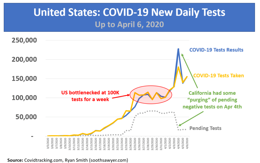
Although the COVID-19 Task Force indicated three million tests would be coming back in early March, the US has still only tested less than two million people. However, we did start to ramp our testing until March 25th where we hit a bottleneck of 100K test per day. Then on April 1st, we fixed that issue and have ramped up to 150K tests per day, as of Apr 6, 2020.
California had a purging of pending tests, all of which happened to be negative. I’m not sure what happened there but this one-day purge should be ignored when analyzing daily trends, as you will see some of it show up in later charts.
Which state is testing for COVID-19 the most?
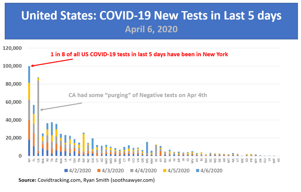
The x-axis is sorted by who has had the most cumulative COVID-19 test results since the beginning of the outbreak. The y-axis shows how many tests have been given in the past 5 days (stacked by each of the last 5 days.
Because of I sorted this by most to least cumulative tests, and you notice lumpiness in the bars (remember the height of the bar is the number of tests over the last 5 days), this indicates that some states are testing more aggressively than they have in the past. As an example, NJ, TX, PA, MI, GA, MS are all testing more than their cumulative sort-ordered position would indicate.
You can see that New York is getting the most tests, both cumulatively and incrementally. In fact 1 in 8 tests went to New York recently. And that makes sense since they are being the hardest hit. In fact, based on my calculations they are still significantly under-testing, which I’ll show shortly.
Why Florida?
What didn’t make sense to me is why Florida has done and is doing more testing than California, since CA has more cases (17,582) than FL (14,853), as of Apr 6, 2020. However, when I looked at my model and predictions (I’ll post later), I noticed that Florida will pass California in number of cases on April 15th (8 days from now) when FL hits 31,000 cases. Furthermore, Florida will have around 20,000 more cases than California by the end of May. So, perhaps that is why Florida has more testing being done than California.
But why more than New Jersey? NJ is being hit way harder than Florida and will have over 160,000 more cases than Florida by the end of May. So why has Florida received and is continuing to receive more testing than New Jersey? It makes no sense to me.
United States COVID-19 Test Results, by State
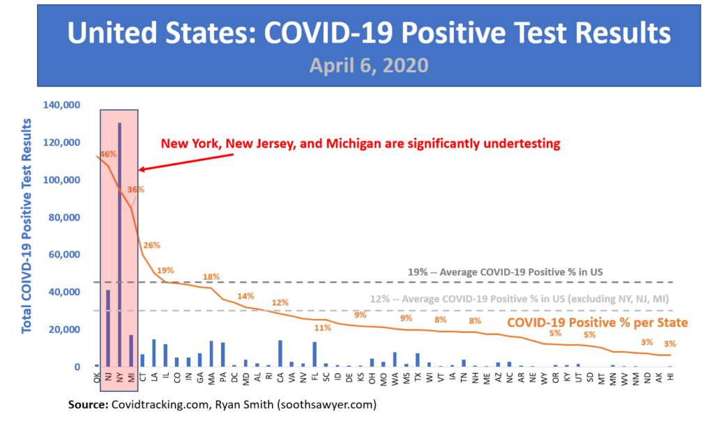
The x-axis is sorted in descending order by the state that has the highest percentage of tests coming back positive (sorted by the orange line). The bars show the total positive test results in each state.
Right now in the U.S., the chance of testing positive, if you are showing enough symptoms to qualify for a COVID-19 test is 1 in 5 (19%).
However, notice the states on the left side of the chart. These are the states that have the highest percentage of positive results, regardless of the amount of tests they have done. In looking at the states that have a significant number of positive results and fall significantly above the overall average of 19%, you see I highlighted three states: New Jersey, New York, and Michigan. These states are seeing a very high level of positive results, which to me indicate that they are under-testing by a lot. In fact, a quick calculation shows that they should have had another 500,000 negative results to just hit the average. That is more than the actual tests they have done so far, which is only 457,094 total tests. This means they are reserving their tests for the obviously COVID-19 sick.
In fact, looking at the death rate of NY, NJ, and MI together, they are sitting at 3.4% of all positive tested patients dying. All other states combined? Only 2.4% death rate. That is a 1.4X higher death rate! This further shows that these three states are only testing the sickest of the sick. Not enough tests. This indicates to me that these three states have a way higher case rate than even the high numbers are showing! Doing some quick math, they have more like 270K cases in these three states, rather than the reported 189K.
If we remove these three under-testing states from the average COVID-positive percentages, the U.S. is sitting at 12% (1 in 8 people) of all tested people being positive for COVID-19. This might mean that if you think you have COVID-19 and go get tested, you have a 7 in 8 chance of having something else.
So, where should the Upper 1% hide?
If you are afraid of contracting COVID-19, what state would offer you the best chances? In looking at the last chart above, Hawaii is your best bet. They have a low percentage of all tests coming back negative at 3% (1 in 33 people) and they have a low number of absolute cases. Additionally, they are hovering around 9.6K tests per 1M people, which sits well above the U.S. average of 6.2K. Hawaii is sounding pretty good right now, isn’t it?
The only problem? You have to go on a two week quarantine when you arrive in paradise. It seems like Hawaii state officials understand what they are doing by trying to deter all the one-percenters.


I have been around IT since I was in high school (running a customized BBS, and hacking) and am not the typical person that finds one area of interest at work; I have designed databases, automated IT processes, written code at the driver level and all the way up to the GUI level, ran an international software engineering team, started an e-commerce business that generated over $1M, ran a $5B product marketing team for one of the largest semiconductor players in the world, traveled as a sales engineer for the largest storage OEM in the world, researched and developed strategy for one of the top 5 enterprise storage providers, and traveled around the world helping various companies make investment decisions in startups. I also am extremely passionate about uncovering insights from any data set. I just like to have fun by making a notable difference, influencing others, and to work with smart people.
Great analysis! Impressive! We definitely should all be in Hawaii, but than the results would be different. 😉 Hope you and your family are well. Tell they hello from me. Let’s get together when we are allowed to travel again. Have a nice week.