
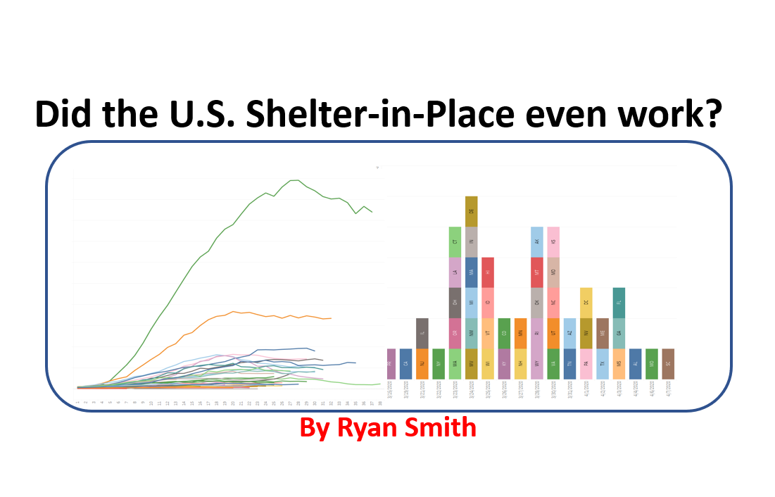
In this post, I look at all states in the U.S. by date, days since each state hit 500 cases, and days since each state’s respective shelter-in-place order. Each of these comparisons provide a unique way to accurately look for correlations. I then identify where each state’s peak is, and then compare how the U.S. shelter-in-place did against five other countries hit hard by COVID-19.
Let’s get started.
COVID-19 in the US (all states) by Date
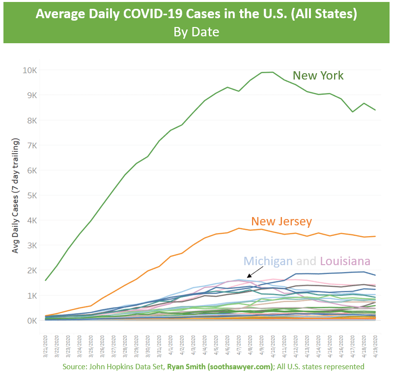
Let’s orient ourselves with the graph: each line is a state (I highlighted a few states by name), the Y-axis represents the daily new confirmed cases (7-day moving average to smooth the lines), the X-axis is the date.
As you can see, New York and New Jersey dominate the graph. There is definitely some kind of peak that has happened for various states between April 6 thru April 10. However, is this due to the shelter-in-place? Each state started their outbreak and shelter-in-place at different times so looking at this by date is not the right way to look at it.
COVID-19 in the US, by Days Since each State hit 500 cases
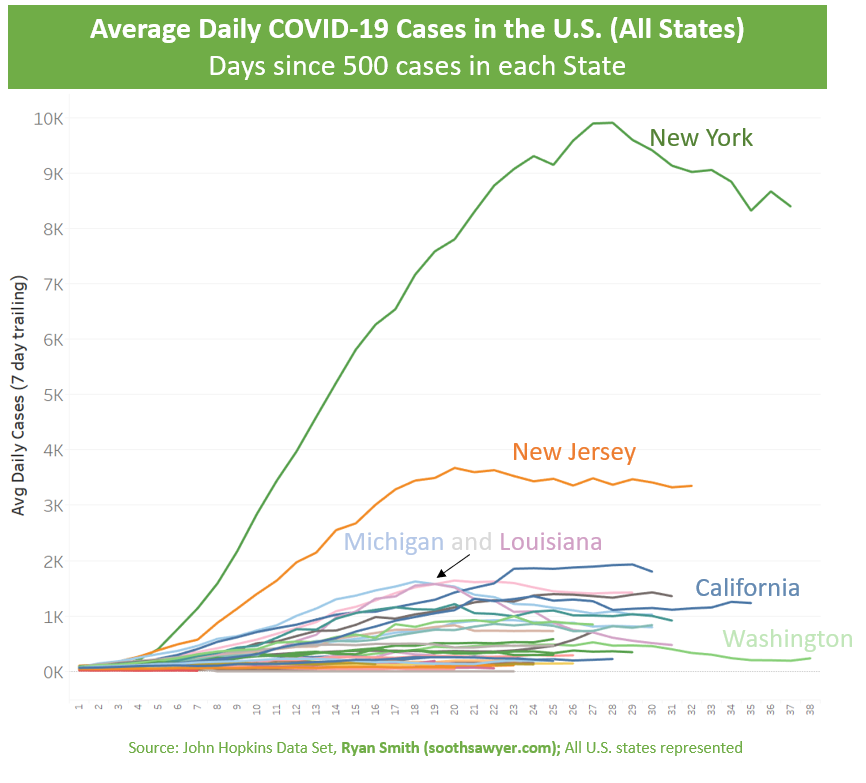
What I did here was throw the date away (from the X-axis) and replace it with something more meaningful: Days Since 500 cases in each state. You can use various starting points for each state’s outbreak, but I went with 500 since it means the state is likely taking the outbreak more seriously and tracking it more closely. Again, all 50 states are represented in the graph here. Notice how some of the lines are cut short. This is because each state is on their own independent journey with COVID-19. Think of “Days Since” being “Age”.
I like comparing between countries, states, and counties this way as it normalizes all regions on their respective starting points so that you can compare against similar aged regions. This allows you to more appropriately compare severity and trends against similar age groups.
In looking at this graph, I see peaks between Day 18-28 for various states. What I would be looking for here is a natural curve to emerge between regions, based on age. Nothing is quite apparent here, so let’s take a look at when the U.S. went into shelter-in-place. The federal government decided to leave it up to the states. Because of this, there isn’t one date to look at; but instead we have to consider the shelter-in-place of each and every state.
U.S. States Shelter-in-Place Dates
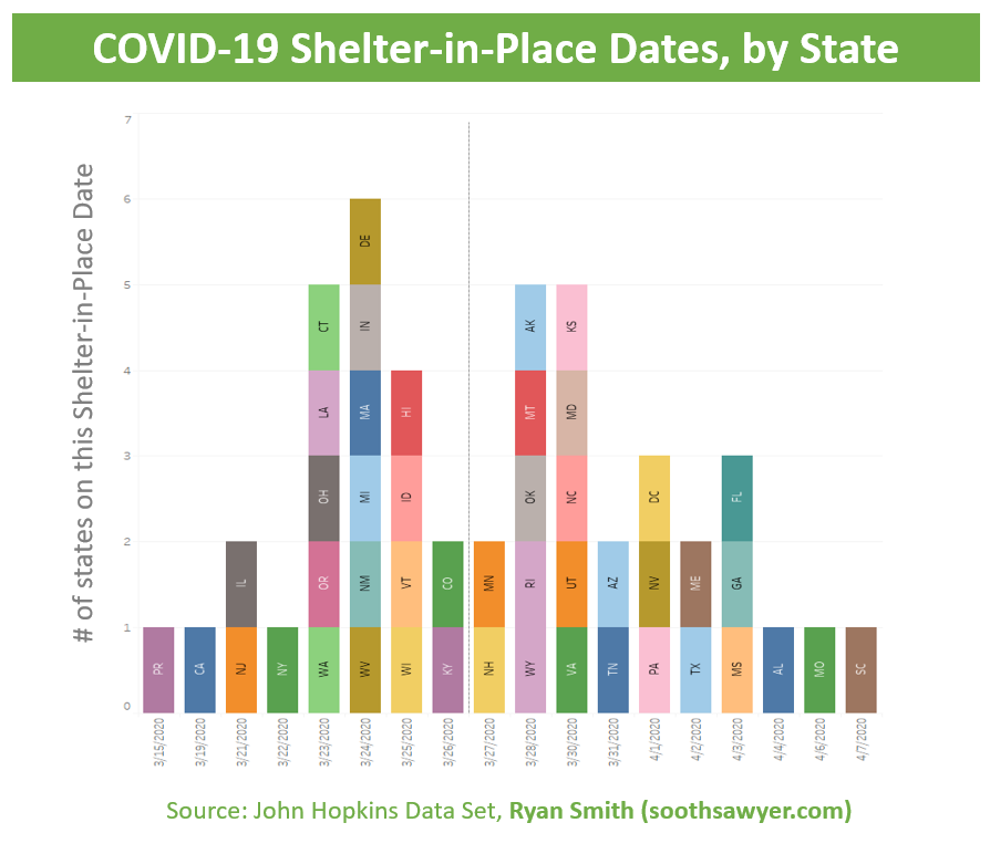
It looks like most states issued a shelter-in-place in the last 9 days of March. Notice the line I put just after Mar 26? I will be using this as a cutoff point later; I will explain more in a bit.
Now that we have each state’s shelter-in-place date, I can do a similar “Days Since” (aka “age”) since the shelter-in-place took hold.
COVID-19 in the US, by Days Since each State’s the Shelter-in-Place
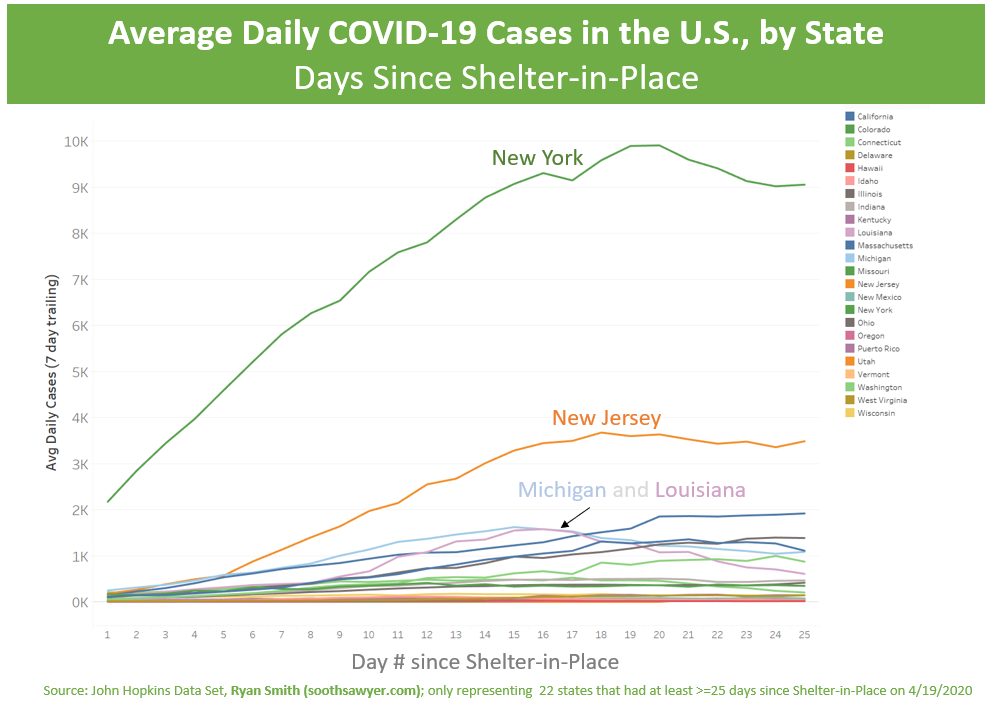
Again, we are looking at the 7-day moving average of new cases for each State. However, now that I’ve calculated each state’s “age” since their shelter-in-place, we can line them all up against each other. Unfortunately, because not all states have had 25 days since they had their shelter-in-place, I had to omit them from the report (there is a “25yr old” minimum, similar to scotch my guests bring over for dinner) otherwise it would have some erroneous drop-off’s in cases as you get to the right of the graph because some states aren’t that old yet. Remember that vertical line I drew in the Quarantine Date chart? Everything to the left of that line has at least 25 days since their shelter-in-place date (as of Apr 19) and are included; This results in 22 states.
It now looks like we have got the peaks between 16-20 days. This is the same 5-day range as the original chart that lined up just on normal dates, so this isn’t 100% conclusive. However, let’s group some of these states together to get a higher level picture with this new view.
COVID-19 cases NY/NJ versus 20 other states, Days Since Shelter-in-Place
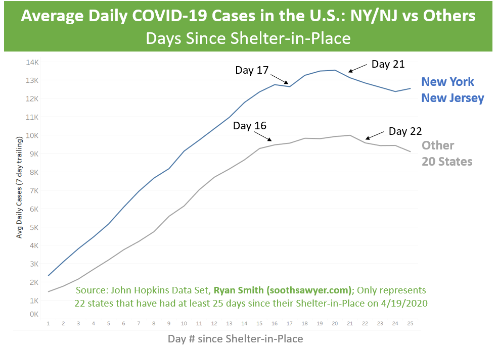
New York and New Jersey stood out as the worst offenders in the US so I grouped them together and threw all other 20 states together. You will notice that they all appear to start having some affects from the shelter-in-place around Day 16-17, peak around Day 19-20, and start to decline Day 21-22. Dr. Fauci has mentioned it would take around two weeks to see the effects of the shelter-in-place and this does seem to support that.
Let’s look at the US as a whole.
COVID-19 in the US, Days Since Shelter-in-Place

This graph is a little trickier than you would imagine. It actually is taking the age of each of the 22 states shown earlier, aligning them on their ages, then combining them to come up with an aggregate age. Unfortunately, I cannot do all 50 states because, as I mentioned earlier, not all are at least 25 days old yet. So, this gives the best view into potentially how well the shelter-in-place worked in the US.
Let’s compare the US to other countries.
Comparing the US vs other countries, days since their shelter-in-place
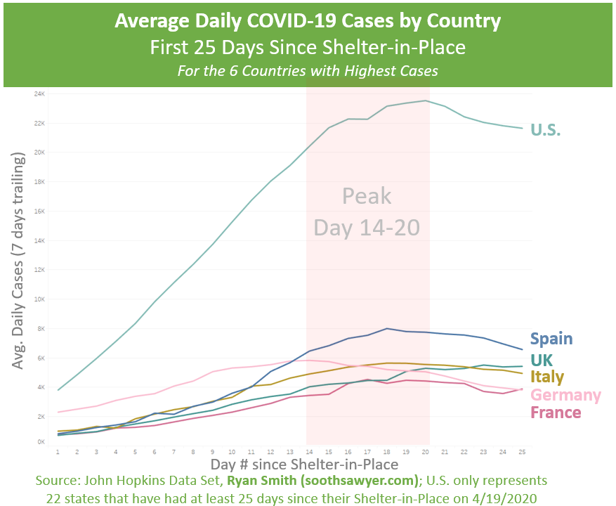
Again, keep in mind that the US only includes 22 states so use its line as a trend rather than the absolute number of cases on a given day.
I chose to include five of the highest case countries to compare the US to, so we can see how each of our “quarantine” efforts have played out. As somewhat expected, we all seem to peak about the same time, based on the age each country is, birth being the date of shelter-in-place.
So, shelter-in-place does initially appear to have influence on the curve. However, it’s hard to conclude if it’s actually due to shelter-in-place or if it’s due to cleaning our hands more frequently, social distancing, no large events, wearing masks, etc. If you think about it, the shelter-in-place orders within the U.S. all started on different dates (see the Days Since Shelter-in-Place charts), but the recommendations around social distancing, cleaning hands, etc started roughly at the same time (see the very first Date chart). And both seem to result in each individual state peaking in the same 5-day range.
What do YOU think?
Next Analysis
What we don’t cover here are some of the things that have bothered me. Why do some countries (and even states within the US) grow at a faster rate than others? Why do some states dominate the number of cases and/or deaths while others stay low? Their appears to be 3-4 groups that emerge (look carefully at the first two charts in this post). We will try to dive into this topic in my next post.
Analyze the data yourself
How did I create all these charts? I used a dataset I created that is based off of John Hopkins COVID data, Wikipedia, US Government data sets, etc. You can download it yourself and do your own analysis! Read more about this dataset here.
-Ryan

I have been around IT since I was in high school (running a customized BBS, and hacking) and am not the typical person that finds one area of interest at work; I have designed databases, automated IT processes, written code at the driver level and all the way up to the GUI level, ran an international software engineering team, started an e-commerce business that generated over $1M, ran a $5B product marketing team for one of the largest semiconductor players in the world, traveled as a sales engineer for the largest storage OEM in the world, researched and developed strategy for one of the top 5 enterprise storage providers, and traveled around the world helping various companies make investment decisions in startups. I also am extremely passionate about uncovering insights from any data set. I just like to have fun by making a notable difference, influencing others, and to work with smart people.
Hey Ryan,
Nice work. From the last graph it looks like the UK have not reached their peak after 25 days.
I think some of the variation between countries states and counties is due to the availability of testing and in the UK’s case on their slow deployment of testing and the criteria for who could get tested.
Regards,
Eamonn.
Hi Ryan
I use a different measure, but one I think works.
If you look at the H1N1pdm09 virus (which is the closest analog in recent times) then the number of US people infected with it when there was no social isolation is around 50 million. Multiply that by the world average 5-7% hospital death rate for covid-19 and you would get up to 3.5 million US deaths. The 5-7% number is calculated taking the ‘national reported case total’ vs ‘national death count’. The US averages 5% but the world (and New york) closer to 7%.
The US is, sadly, around 40,000 covid-19 deaths as I write so hugely under compared to the comparative 3.5 million for H1N1pdm09 I used as a control group. H1N1pdm09 is a reasonable parallel as it was a different, new, mutation of the H1N1 Flu Type-A serotype for which immunity was not present just as for covid-19.
I treat shelter-in-place and social isolation and mask wearing as one item as they are somewhat co-dependent. It looks to me that rapid sheltering, as we had in Santa Clara county made a huge difference and my numbers above project that too.
The UK published figures today on national mortality which shows a much bigger mortality spike – death count – than the standard figures for covid-19 show because the standard figures generally only include hospital admissions. I didn’t use this measure as you also need to know how many non-hospitalized recoveries there are too.
Even if my H1N1 based projection is pessimistic by an order of magnitude it is still a lot of life saved.
The issue was not acting early enough and that the virus was spreading in February before anybody acted.
Be cautious comparing areas where population density is different, and remember metro and foot traffic is much higher in NYC which increases contact possibilities.
Thoughts?
Tim (also on house arrest)