
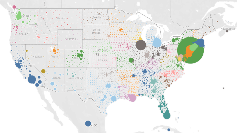
This visualization shows the growth in COVID-19 cases in the US (and the rest of North America), at the county level, from March 15th – April 15th. If you hold your mouse over a given county it will show you the cumulative cases/deaths, new cases/deaths, and ICU beds, in each county. You too can create your own pivots/visualizations using the COVID-19 Ultimate Data Set I created.
Make sure to the play button (right triangle) to watch the visualization. You can technically move the map around and see the rest of the world’s data as well (hidden feature).


I have been around IT since I was in high school (running a customized BBS, and hacking) and am not the typical person that finds one area of interest at work; I have designed databases, automated IT processes, written code at the driver level and all the way up to the GUI level, ran an international software engineering team, started an e-commerce business that generated over $1M, ran a $5B product marketing team for one of the largest semiconductor players in the world, traveled as a sales engineer for the largest storage OEM in the world, researched and developed strategy for one of the top 5 enterprise storage providers, and traveled around the world helping various companies make investment decisions in startups. I also am extremely passionate about uncovering insights from any data set. I just like to have fun by making a notable difference, influencing others, and to work with smart people.
Sir, Please brother make urgent video on this Cumulative COVID-19 Cases on 5/1/2021 full details dashbords with all sheet video and publish on YOUTUBE, And please mail me video link on this Email id
amarpawar8833@gmail.com