
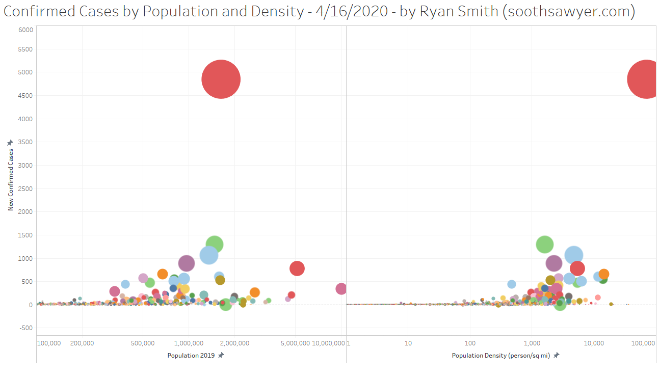
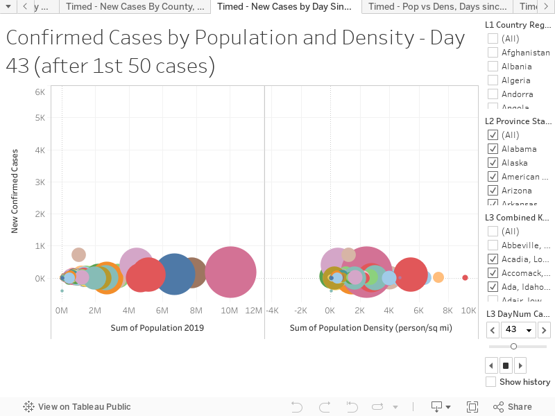
This visualization shows the growth in COVID-19 cases compared to population (4/16/2020, R=0.33) and population density (4/16/2020, R=0.75; if you look at this by Days Since instead of date, R>0.80) in the US (and the rest of North America), at the county level, from March 15th – April 16th. If you hold your mouse over a given county it will show you more information. You too can create your own pivots/visualizations using the COVID-19 Ultimate Data Set I created.
Make sure to the play button (right triangle) to watch the visualization. I included the rest of the world’s data as well (hidden feature). However, keep in mind that outside the US it’s at the province and/or country level which makes the correlations drop (because there is a lot of empty space between major cities).
You can view this visualization directly on Tableau by clicking on the below link:

I have been around IT since I was in high school (running a customized BBS, and hacking) and am not the typical person that finds one area of interest at work; I have designed databases, automated IT processes, written code at the driver level and all the way up to the GUI level, ran an international software engineering team, started an e-commerce business that generated over $1M, ran a $5B product marketing team for one of the largest semiconductor players in the world, traveled as a sales engineer for the largest storage OEM in the world, researched and developed strategy for one of the top 5 enterprise storage providers, and traveled around the world helping various companies make investment decisions in startups. I also am extremely passionate about uncovering insights from any data set. I just like to have fun by making a notable difference, influencing others, and to work with smart people.