
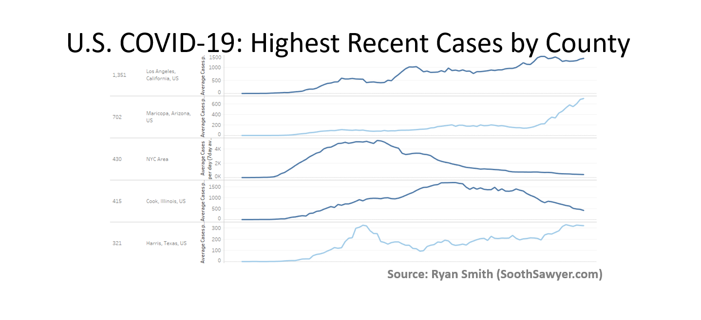
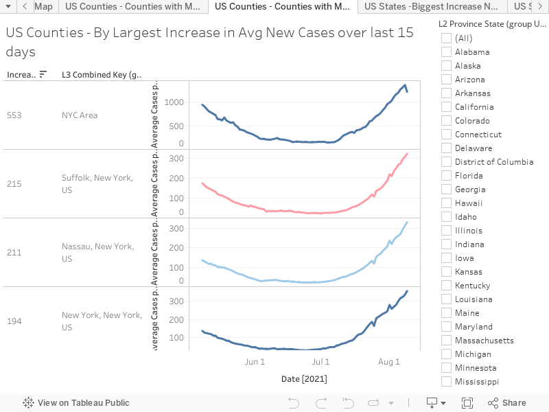
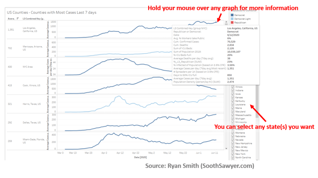
My Tableau visualization will allow you see the current hot spots (sorted by highest [7-day] average number of new cases in the last 15 days) in the United States. This has all 3,000+ U.S. counties and shows you the average daily new confirmed cases (moving 7 day average). Additionally, the color of the graph indicates the political affiliation of that county.
View directly on my public Tableau (for a larger view) by clicking here or interact with the embedded visualization below: (view the same chart but by state by clicking here)
Tips for using the above visualization
I added a helpful filter so you can look at any state(s) you like. Additionally, hold your mouse over any of the line graphs for more info about that specific county. Enjoy!

I have been around IT since I was in high school (running a customized BBS, and hacking) and am not the typical person that finds one area of interest at work; I have designed databases, automated IT processes, written code at the driver level and all the way up to the GUI level, ran an international software engineering team, started an e-commerce business that generated over $1M, ran a $5B product marketing team for one of the largest semiconductor players in the world, traveled as a sales engineer for the largest storage OEM in the world, researched and developed strategy for one of the top 5 enterprise storage providers, and traveled around the world helping various companies make investment decisions in startups. I also am extremely passionate about uncovering insights from any data set. I just like to have fun by making a notable difference, influencing others, and to work with smart people.
This is a great map!! I was able to check my county, my home county in Ohio-anywhere I wanted to go! Thanks so much!