
About a week ago, askamanager.org (with 2 million monthly visitors) collected over 26,000 salaries from ordinary people like you and me. And Alison Green was kind of enough to share the Google spreadsheet of all the submissions. Although there are some issues with the data collected (which I’ll talk about at the end of this post for those that care), there are definitely some insights that can be gained from this work. So, I extracted, transformed, and loaded the results into Excel, using PowerQuery, and this is the result.
Let’s get started.
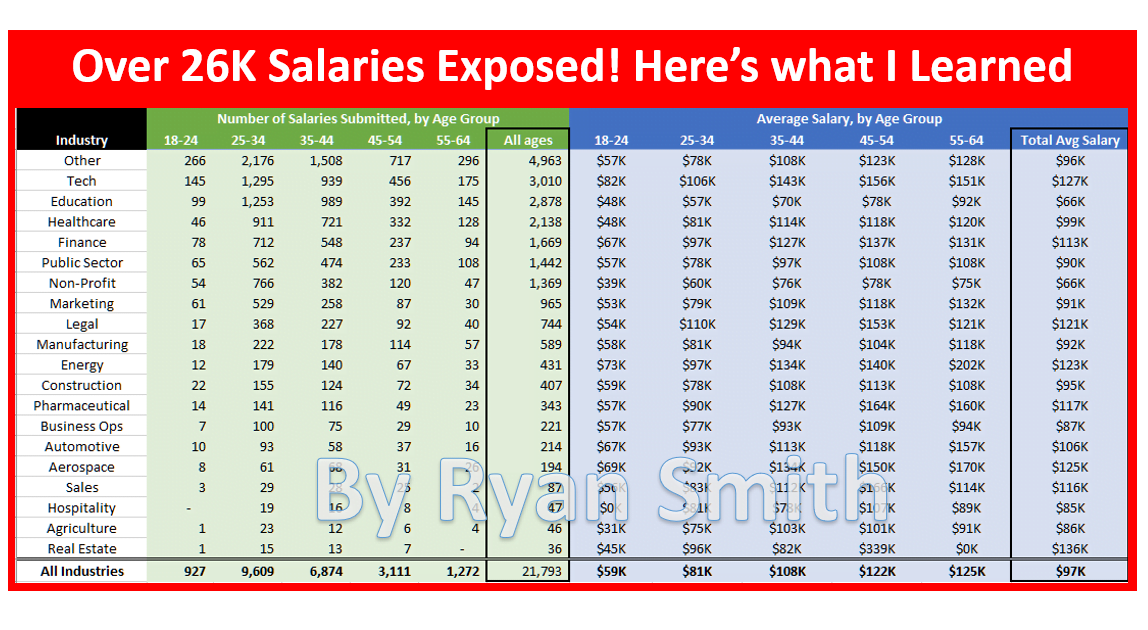
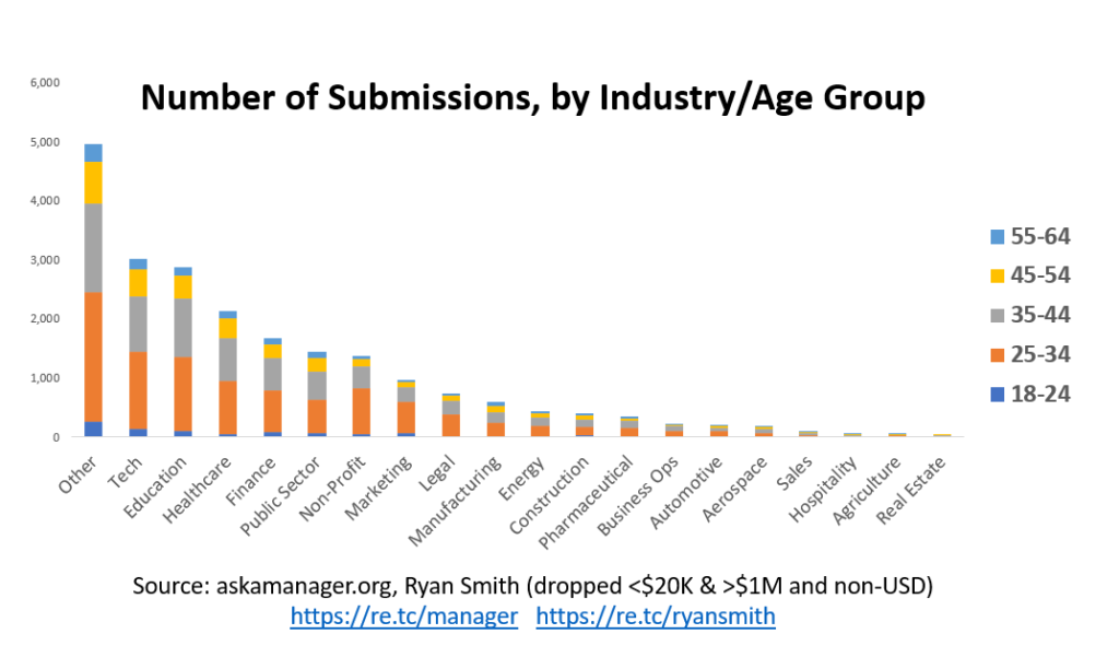
Average Salaries by Industry/Age Group
Above, you can try to find your industry and age group to see how your salary compares to those submitted. However, keep note of the number of entries for your cohort. If it’s too low, it’s not a large enough sample size to trust. For example, as you get below Pharmaceutical the number of entries is pretty small for each age group. If you find that your relevant age group and industry is too small, look at the total for all ages in that industry or totals for your age group to get a better idea of where you compare.
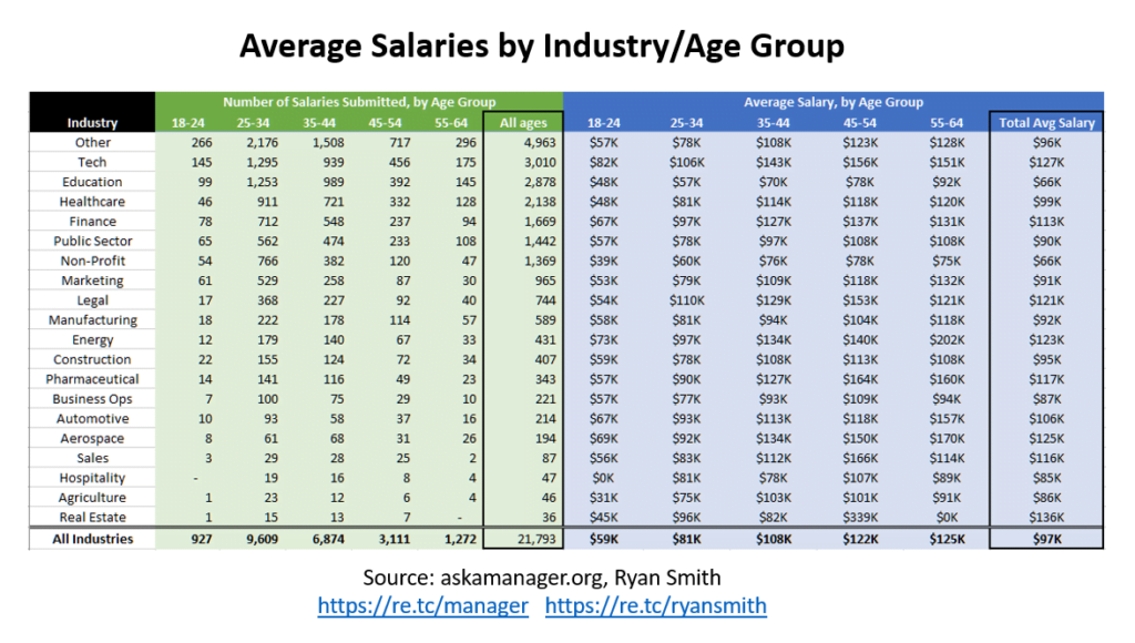
Average Pay by State
Keep in mind that some of the states don’t have many submissions so the data may be skewed based on the limited entries (e.g., Montana has a total of 12 entries). And, in my cleansing of the data I don’t capture all entries correctly into each State (see end of article as to why) and some will be lumped into “Other” depending on whether my lookups correctly grabbed the State.
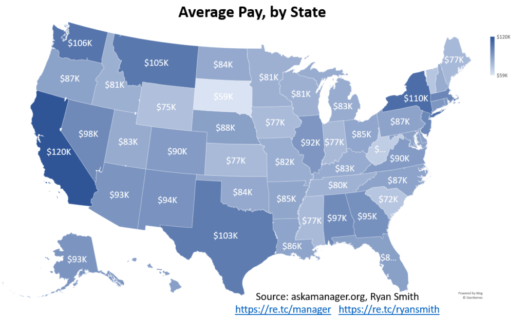
Top 5 Paying States
I looked at the top 5 paying states (that had enough submissions to not be too skewed) and here are the results.
CA, NY, WA, TX, DC coming in for the win! Notice above that that pay rapidly (relative to later periods) increases into your 30’s and 40’s but then slows down dramatically. The below graph illustrates this by looking at pay increases (compound calculation to simulate yearly pay raises).
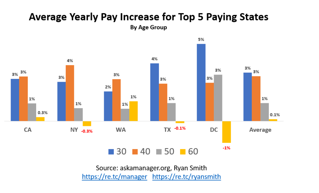
This tells me that if you are between 20-40 years old and not getting an average of 3% pay raises on a yearly basis that you are falling behind the norm. Note that this is just slightly above a healthy 2% inflation rate. Using the rule of 72, it would take 24 years to double your pay at 3% yearly increases. Once you are in your 40’s, your rate of salary increases slows down dramatically! Is this age discrimination? Laws of larger numbers? The older you get the less pay increases matter? The data is flawed/statistically insignificant? You decide.
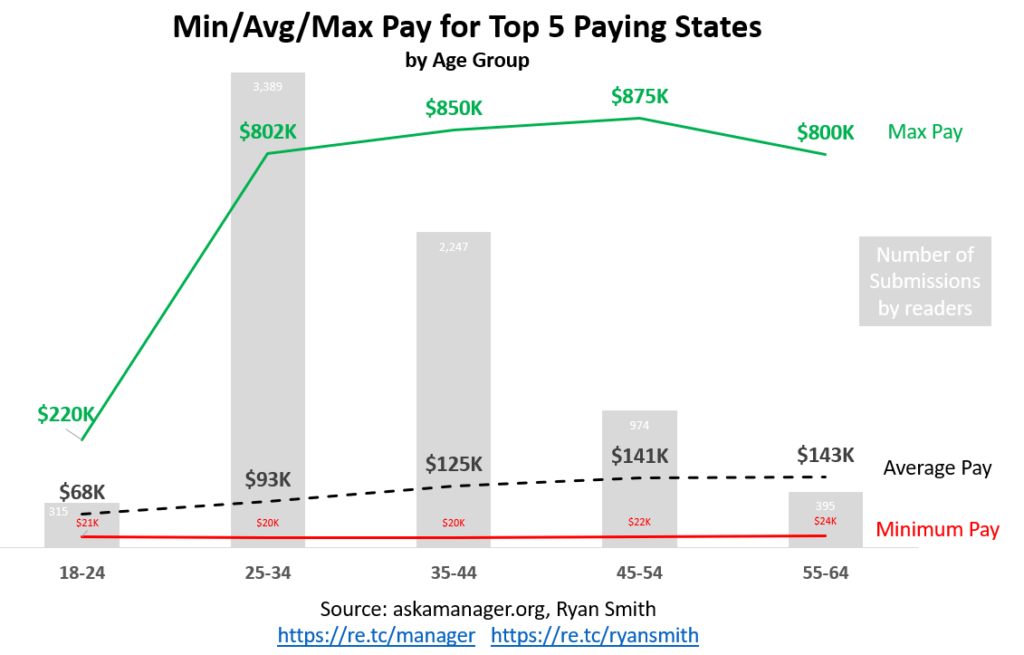
In the chart above, it’s interesting to see the discrepancy between the average pay and max pay. Note: As I discuss in the next section, I lopped off over $1M salaries and the salaries are not validated, so take it with a grain of salt. Keep in mind that there are tons of professions within an industry so picking the right profession and different levels of seniority will dramatically affect where you fall.
Important Notes about the Data and Analysis
To get the data into a format I could work with, I did exclude salaries below $20K and above $1M to avoid extremes (people had fun with some of their entries) and I only looked at USD currency (this dropped the entries from 26,000 to 22,000); I only wanted to spend so much time playing with this data. Additionally, I created lookup tables to normalize the States and industries as fast and effective as I could, as well as cleaned up some of the other inputs. You can download the spreadsheet that I created that leverages PowerQuery to grab the data straight from Google Sheets and Wikipedia (for State populations) so you can easily refresh, transform/clean, and pivot the latest salary submissions.
I looked up US Census data by age and compared it against the submissions to askamanager.org.
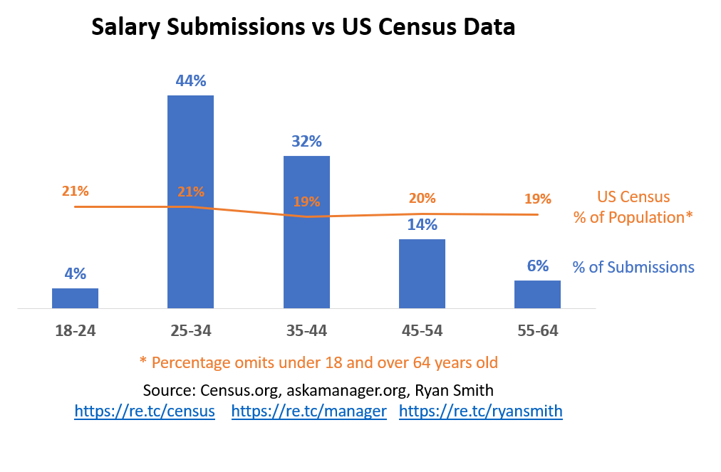
Above, you can see that the US population (the line in the chart) is pretty well distributed among age groups (I ignored below 18 and above 64) but the salary submissions show that the 25-44 year olds are over represented in this survey. And the other age groups are underrepresented. I would guess this is likely due to the demographics that askamanager.org attracts but further investigation would be needed.
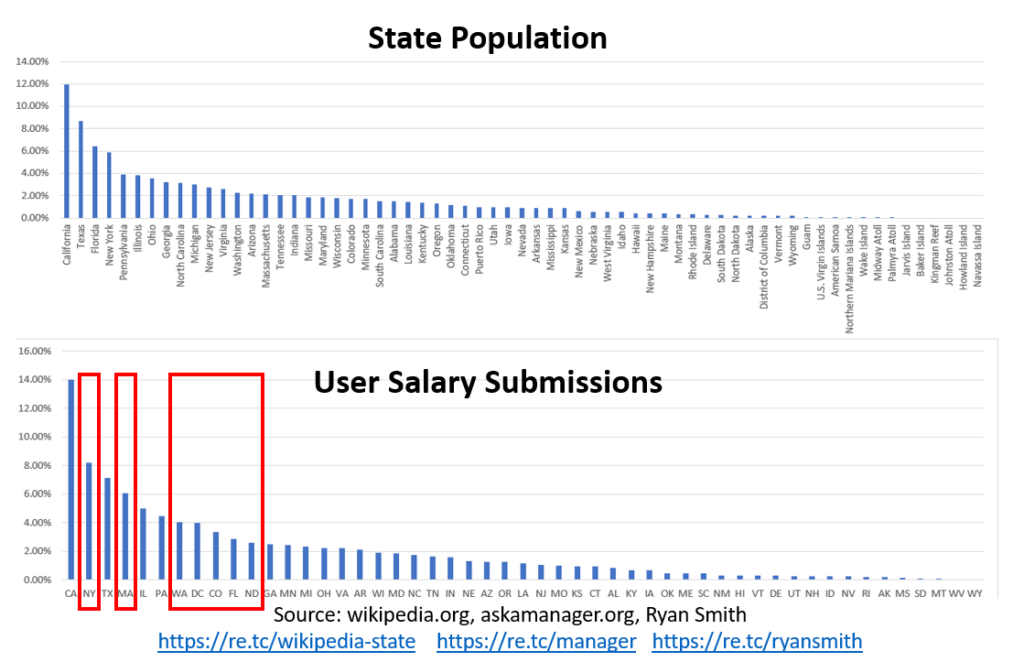
In the chart above, I looked at the State population data and compared this against the survey data and I highlighted some anomalies in over and under-represented States. Again, this could be due to the demographics of askamanager.org.
You can see certain industries were well represented in this survey. However, this could be due to my bucketing of the free form submissions and I could have made errors doing that (after all, this is a free gig for me).
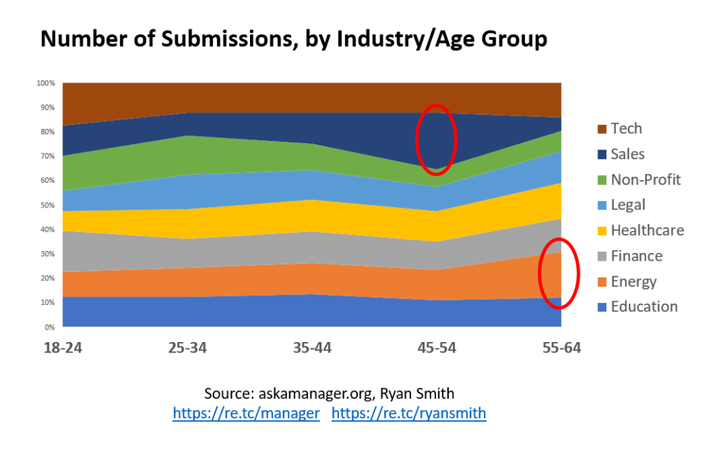
As you can see above, I noticed some interesting bubbles in submissions for certain industries and age groups although this may be due to insufficient number of entries for those industries so may be nothing. I would have liked to spot a trend of certain industries holding on to their aging workers more, which I do tend to see sales people stick around as they age; maybe they just enjoy their job that much!
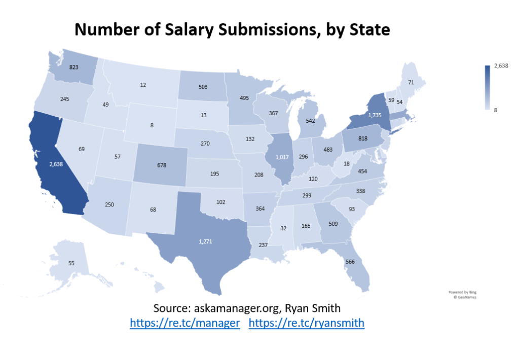
As I mentioned earlier, some States were under represented in the survey, based on my bucketing.
I wouldn’t get too hung up on details in the results since it includes non-validated salaries, free form data that I semi-cleaned up, and not enough entries in certain States/industries to dissect too much. For their next survey, I would suggest tightening up the user entry to make insights easier, more accurate, and less prone to errors.
Summary
Although not perfect, it’s fun data to look at. I found it interesting to look for correlations in survey entries versus consensus data to check accuracy/bias. I was also surprised to see the pay increases slow so dramatically as you age and would love for more research to be done; Is this due to the more you age, the less focused you are on pay increases and more focused on doing what you enjoy?
I encourage you to download my XLS and do your own analysis or improve upon what I’ve done here. Everything in this post is in the XLS so enjoy.

I have been around IT since I was in high school (running a customized BBS, and hacking) and am not the typical person that finds one area of interest at work; I have designed databases, automated IT processes, written code at the driver level and all the way up to the GUI level, ran an international software engineering team, started an e-commerce business that generated over $1M, ran a $5B product marketing team for one of the largest semiconductor players in the world, traveled as a sales engineer for the largest storage OEM in the world, researched and developed strategy for one of the top 5 enterprise storage providers, and traveled around the world helping various companies make investment decisions in startups. I also am extremely passionate about uncovering insights from any data set. I just like to have fun by making a notable difference, influencing others, and to work with smart people.